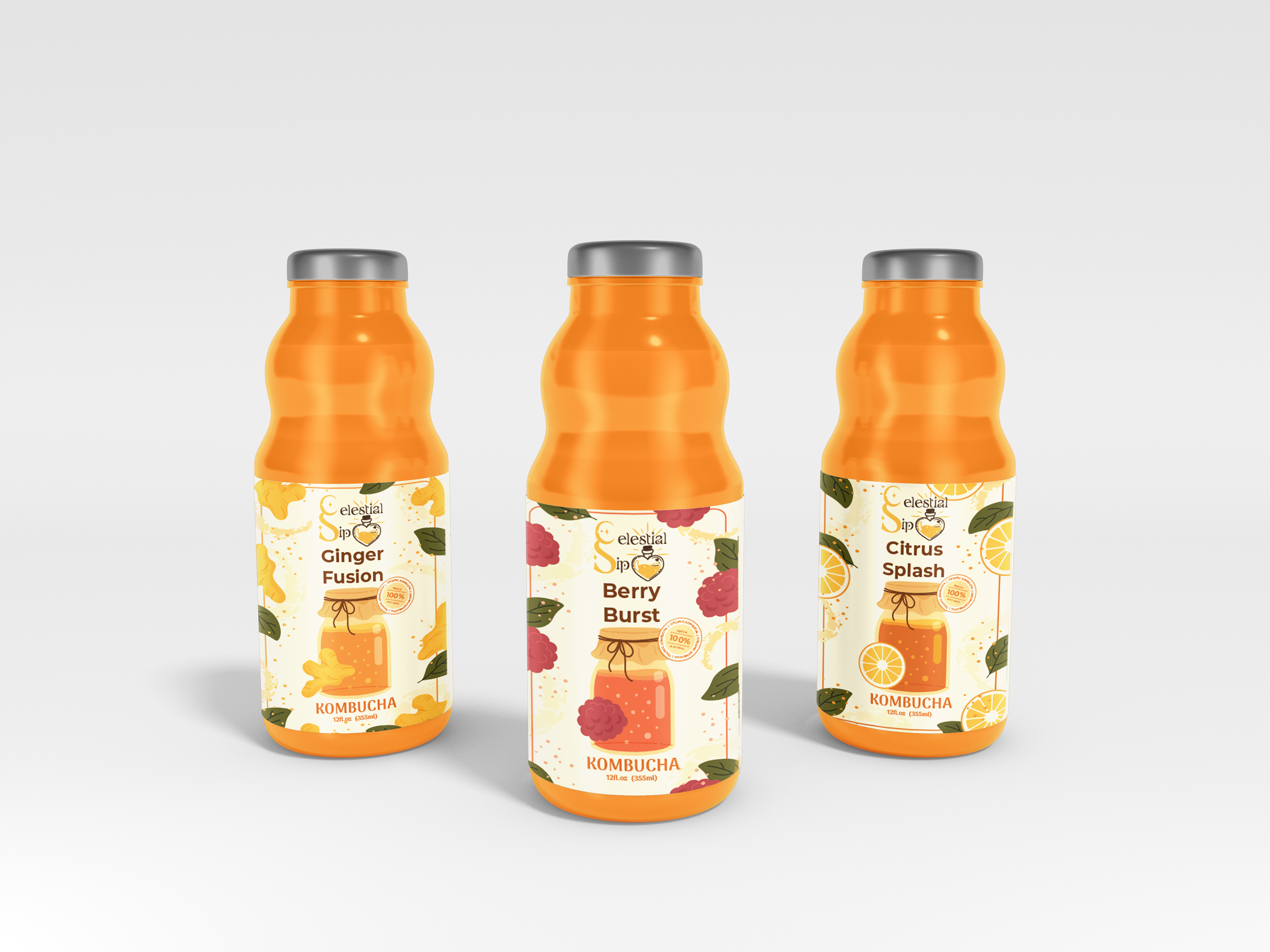
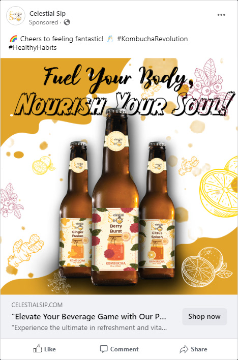


The client aims to create a kombucha drink brand with a striking logo and bottle designs. The logo features a serif font, while the bottle illustration features a heart-shaped bottle with a potion inside. The project also involves designing colors and themes, involving research, inspiration, and understanding the project's purpose and audience. Primary colors are red, blue, and yellow, secondary colors are green, orange, and purple, and tertiary colors are combinations of these colors. Color harmony is achieved using complementary, analogous, or triadic color schemes.